Sunday, 7 February 2010

Postcards

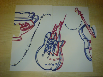
I started to cut out the leaflets, it's quite hard to get them to fit perfectly, but it portrays our idea clearly.
When putting the jigsaw pieces together, I realised that the images do not fit together perfectly, they are at least 1cm off and the text doesn't flow to the next piece :(

Wednesday, 3 February 2010

ring

http://collections.vam.ac.uk/item/O109108/ring/

same ring- but the engraving doesnt look like a smiley face!

Monday, 1 February 2010

Revised Illustrations


Thursday, 28 January 2010

Descriptions for Flyers

1- Teapot


Object: Teapot
Place of Origin: Britain, 1951
Museum Number CIRC.18&A-1952
Location: Making Ceramics.
                Room 143, Case 2, Shelf 2


An example of typical bold design and bright
colours popular during the 1950's. This particular
model of teapot was from Heal & Sons LTD,
the leading retailer of domestic style at the time.


2- Cup


Object: Cup
Place of Origin: Tonola, Mexico
Museum Number: 295-1872
Location: World Ceramics
                Room 145, Case 42, Shelf 2


In 1805, Spanish women used to eat fragments from
these Bucaros de Indias believing there to be
gastronomic benefits. Not only used to flavour water,
they were also used to purify polluted water and even
detect poisoned liquids.


3 - Guitar

Object: Guitar (Les Paul)
Museum Number: S.12 - 1978
Location: Theate & Performance
               room 103, case1, shelf A

There was at least one person on drugs at a gig by "The

Who" in 1976 where Pete Townshend smashed his 
guitar live on stage. The lead guitarist and
songwriter for The Who, his guitar is currently on 

display in the Theater & Performing Arts collection.


4- Cello


Object: Cello
Place of origin: Venice, 1700-1800
Museum Number: W.4-1950
Location: Musical Instruments
                Room 40a, Case 55


In the 1750 the cello had all but replaced the bass viola. 
This one belonged Jean GĂ©rardy, a well known Belgian

cellist and accompanied him around his European 
and American tour from 1890 until 1920. 


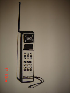
5- Telephone


Object: Coral Mobile Telephone
Place of Origin: Britain
Museum Number: W.17-2003
Location: National Art Library
                Room 76, Case 21


An example of the first hand portable mobile
telephone from 1985. Although hardly pocket
sized, with a very limited battery capacity,
it sparked a revolution that is still continuing to this day.


6 - Ring

Object: Jewish wedding ring

Place of Origin: Central or Eastern Europe 
Museum Number: 453 - 1873
Location: Sacred Silver & Stained Glass

                  Room 83, Case 8A


The architectural for of this ring is actually

based on Salomon's temple; the ideal Jewish 
home. The ring is supposed to symbolise the 
couple's future together and the inscription 
of Mazel Tov which means good luck.

Revised Copy

  • hot water goes in a [teapot]
  • another type of [pot]
  • is one used by musicians
  • who might play [guitars]
  • which looks like a [cello]
  • this sounds like hello,
  • often the first thing you say on the [telephone]
  • when it [ring]'s.

The Copy

Right! What do you think?
I need the fact about the yummy vessel! but this what i have thought so far.
  • in 1905 spanish women used to eat flakes from water vessels for gastronomic benefits.
  • vessels are also referred to as pots,
  • this is a slang term for drugs
  • there was at least one person on drugs at a gig by 'The Who' in 1976 where Pete Townsend smashed his his guitar live on stage. which is on display in the Theatre and performing arts collection at the V&A.
  • another instrument on show in the V&A is a cello (i need some information on the cello??)
  • cello sounds like hello.
  • hello is commonly used to answer a telephone
  • There is the first mobile phone is also on display in the 20th century collection at the V&A
  • Phones Ring,
  • there is a ring in the jewellery collection at the V&A 
WHAT ARE YOUR THOUGHTS??


Wednesday, 27 January 2010


Print Implimentations


We thought that it would relate to our concept of Linking obejects and would also interest the target audience more if our 'postcards' were in the shape of jigsaws, so they could be collected and put together, creating the journey, and story. It makes the 'tour' of the museum more personal and makes the visitors feel as if they are working out the story them self which makes it more interesting for them. It also connects the pieces in the collections phisically as well as visually.

We also thought of the places we could see our adverts being used, the main places we thought we could have them would be anywhere near publich transport as the majority of visitors are from london, and would be travelling on public transport.

We can see our designs in:
  • Buses: on the outside oif a bus, inside, in the straps you hold on to (bookmark width strip) bus stops.
  • Trains: on the walls of the tunnels, moving adverts, inside the carriages, along the esculators, on the platform.
  • Oyster card carriers, maps.

Outlines

Here you are my hard little workers :)


Yummy Vessels!


Rux

Final 6 Links of Seperation

Teapot -> Spanish Vessel pots -> Pete Townsend's Guitar -> Cello -> Hello -> First Mobile Telephone -> Ring

Teapot:
http://collections.vam.ac.uk/item/O19557/teapot/

Vessel:
Rux has images

Guitar:
http://collections.vam.ac.uk/item/O141374/guitar/

Cello:
http://members.shaw.ca/wmacza/cello%20014.jpg 

Mobile:
http://collections.vam.ac.uk/item/O101208/telephone-coral/

Ring:
http://www.vam.ac.uk/images/image/37943-popup.html

These are the images we will be using in the 6 degrees idea that we will be presenting to the V&A.

Monday, 25 January 2010

Third Crit with Jake

Friday 22nd January
2.45
We started off discussing the idea that we had resolved to stick with: 
6 Degrees of Separation/ Links.


Jake thought that the main concept was great, just that the links we had made were not interesting enough, we needed to make the links between the objects more exciting, entertaining, and furthermore appeal to our target audience. This could be achieved by making the links between the objects silly and maybe giving the links a narrative. 


For example, Queen Victoria's knickers can be found in the V&A --> when Queen Victoria first saw the statue of David, she declared that his 'manhood' should be covered up by a fig leaf, that ornamental leaf can be found in the museum. We needed to make these links more lively and appealing.


A way we could do this is by making stories up, ridiculous situations/ scenarios..
for example:
You can find James II spectacles in the V&A --> as can you find Elton John's Glasses --> Elton John is  gay, likes penis --> you can see many in a lot of the statues and so on.
We also thought that we needed to make the facts relate to British Youth cukture more, Jake found taht he related to Elton John's Doc Martins and Pinball Wizard Tommy(?) and these aspects of the V&A were what appealed to him, so we need to focus on what will appeal to our target audience rather than appealing to people who visit the museum already.
(Rolling stones logo, Vivienne Westwood etc.)


Ideas for narratives:
Random Story Generation, words out of a hat.


We also spoke about the format of our leaflets posters, how we thought if would be good if the leaflets could be collectables and they would tessellate to make a big poster. Jake suggested to look at Tangrams.

The shapes of our leaflets would not have to be boring rectangles but made up of different sized triangles and other shapes which could all be put together to invent stories/ narratives about the objects. 
For example, one shape could say: the vases were used by... and another could say Queen Victoria or Elton John or The rolling stones... to store drugs or as herbal remedies and so on. Different arrangements of the shapes could result in different narratives.


Another option would be to have the leaflets postcard shaped and have the paper embossed, textured, coloured to make them more engaging. 


We decided that every element of our project needs to be more relevant and engaging, especially the story element, maybe through the use of humour?
Also, the red and blue that we used in the presentation sheet could be used as the basis of our colour scheme and the colours are bold and bright, representing the national colours of the British flag, yet remaining contemporary. 
Angeli

Illustrations

Here's some illustrations I did today based on the links we've made with a few of what we thought were interesting objects in the V&A. First there's Elton John, then a teapot shaped like an aeroplane and finally a Mochino handbag that kind of looks like an ice cream and therefore links to the tongue in the original Rolling Stones logo kept in the museum.


Rux

Navigation

I thought we could use a similar visual navigation system to the London underground tube maps to help direct visitors to different rooms in the collections.


In response to this idea, I created rough outline drawings and put the following draft leaflet mock up:


Angeli

Statue of David/ Fig Leaf


Just playing around with the idea that Queen Victoria didn't approve of the nudity in this statue? cut and paste idea?
See you guys tomorow x


Ferg


Dressing Up

"My Dressing Up Box"?


I don't quite know how to visualise this, maybe a pop up leaflet or phonejacker style animation with them all popping up?


I'm drawing a bit of a blank here, but could do with some thought? 


The idea of dressing up and playing is one of the best ways of interacting with the collection, even for the 16-24 age range (as show by the feedback from when we went to the V&A first Tuesday back).


But would that be at odds with what we've done so far?


How about we make up some drafts/ thumbnails as a group and see if its worth doing or not?
Aneeka